Black, hairlines, one light.
The look comes from hourslip.app, one of the apps, and the studio's other sites share it. Everything below is the live system, rendered from the same stylesheet the rest of the pages use - so when one of them changes, this page has already changed with it.
One accent. If it is blue, it is a glow, a kicker or a focus ring. Buttons are white.
Objects are near-black panels drawn with a 1px hairline. No soft shadows.
Colour belongs to the products. Each app brings its own tint; the site stays out of the way.
Black, near-black, and some light
The page is --bg, pure black. A band or a tile that needs to separate from it
is --soft, one step above, with a 1px --line round it. Light comes
from behind: the accent blurred behind a hero frame, or an app's tint rising from the foot
of its tile.
The accent tile glows from one corner.
Six tokens, and the colours that are not ours
Every ratio below is computed from the hex beside it at build time. The palette itself is
imported from src/data/palette.mjs, the same literal
tailwind.config.mjs reads - this page holds no copy of it.
The tokens
#000000 The ground, pure black. The name is from two looks ago; base.css says why it stayed.
#0B0B0D A panel on the ground, one step above black, with a hairline round it.
#F5F5F7 Headings and strong text. Off-white: only the solid button is pure white.
#A1A1AA Body copy. --ink-3 (#8A8A94, 6.1:1) is the dimmer step, for dates and notes.
#6E8BFF Kickers, glows, focus rings, the gradient word. Not buttons: those are white.
#1D1D22 Hairlines: table rows, dividers, the nav's edge once you scroll.
The apps' tints
Read from projects.ts, where each was taken from the product's own site. An
app's tint glows up from the foot of its tile, and on its product page it takes the
accent's place.
#3E8BFF HourSlip #8B7CFF Folio #5FBF86 Avtoceni #C6F45A Gabble #FFB81F Retriever #C6F03A Cleat #FF8A3D Small Skies #4FB0F0 Capta #FF6B81 Sunflower #F0B429 Cadence #3DBA84 Sleep Timer #7A86F5 One face, two weights
Inter, variable, self-hosted. JetBrains Mono is still loaded and sets code and nothing
else; it was the body face of every page until this look, and the day it stopped being a
label face is the day code started standing out again.
Software for people
Body copy is --ink-2 at 17px on a 1.55 line-height. Longform in
prose.css opens that to 1.72 and brightens it, because grey on black is
tiring over twelve hundred words. Headings are 500 at -0.035em.
The coloured word, the kicker, the link
One word in a heading can carry colour: a gradient clipped to the glyphs, solid accent
where background-clip: text is missing. The class is still .hl,
from when it was a highlighter stripe behind the word.
The one object
Everything that needs to read as a thing is a rounded tile at --radius. The
older class names are from the paper look and were kept because nearly forty files use them;
new work should reach for .s-tile.
Near-black on a hairline. Sits on the page.
A step lighter, on a brighter hairline.
A link. Its hairline brightens and it lifts under the pointer.
.s-app, tinted
An app's tile
Lit from below in the product's own colour.
.s-lilac
A course
One of two fixed washes.
.s-mint
The other course
So neighbours never match.
Pills
A button is a pill. The solid one is white, for the one thing a view most wants pressed; the quiet one is a dark panel on a hairline. Skill chips fill with their level under the pointer.
Arrive once, then hold still
Content reveals with .reveal, a view() timeline with no
JavaScript; where scroll-driven animation is unsupported the keyframes run for zero
seconds and land on the visible frame, so unsupported means already revealed and never
invisible. Tiles lift two or three pixels on --ease. --spring
overshoots, and is kept for toys: tools sit still.
Everything that moves stops under prefers-reduced-motion.
One object, and a lot of air
Every cover, card and share image is drawn by a script and committed; the tooling that
draws them is not. A picture is one object: the thing you would put on the app's icon.
It sits on one of two grounds. Dark is near-black with stepped rings of light, a glass
tile and a glowing glyph, with colour spilling out from behind the tile. Pastel is a
pale field deepening into the product's own colour, with one frosted object floating on
a soft shadow. A set mixes the two, so a row of cards is never six black rectangles.
There are no outlines anywhere, and nothing is random: the same input draws the same
bytes. scripts/art-kit.mjs is the whole vocabulary, and its header has the
two attempts that came before this one.
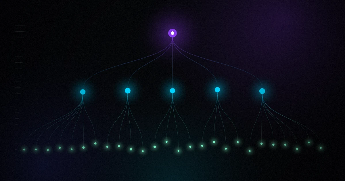
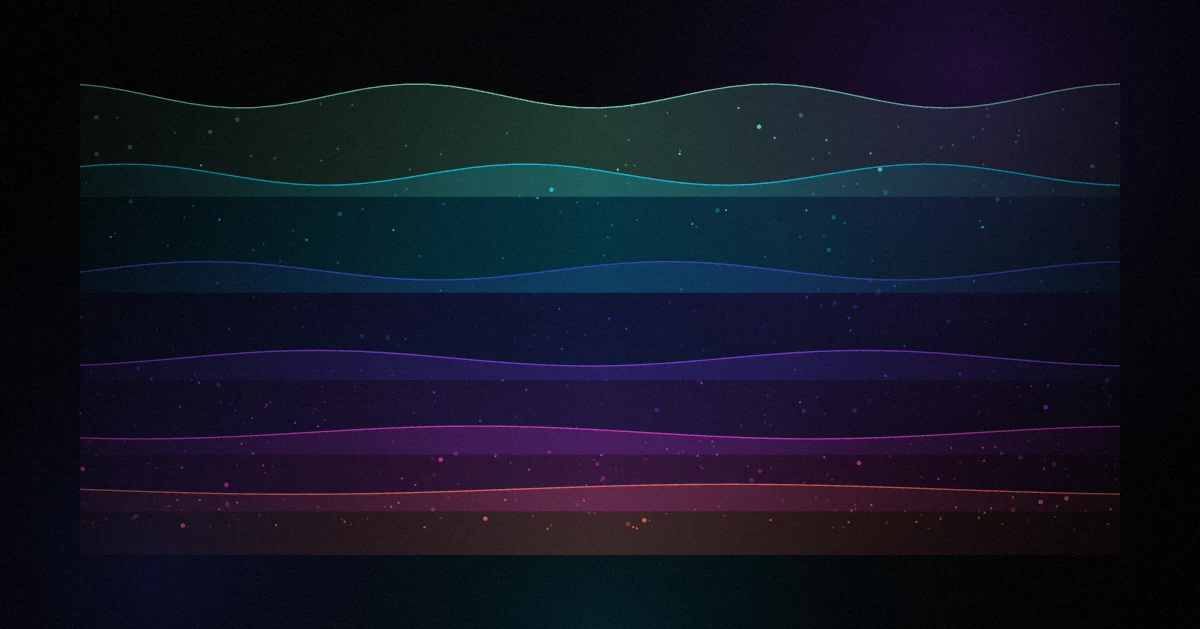
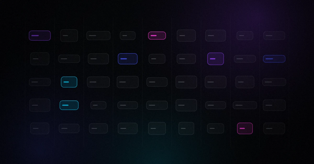
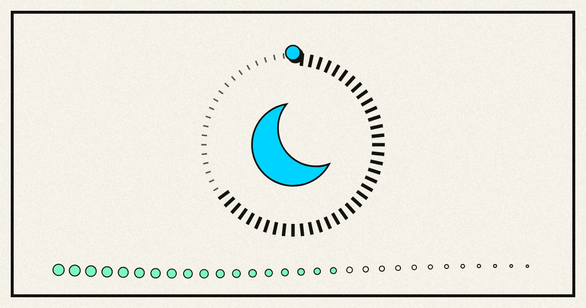
scripts/product-cards.mjs images/products/<app>-card.webp One object per app: the pile on the home page and the corner of each tile.
scripts/post-heroes.mjs post heroes One object per post. Wordless: the alt text carries the meaning, so a reworded sentence never costs a re-render.
scripts/og-card.mjs og-default.png The share card every page falls back to.
scripts/og-product-cards.mjs og-<app>.png One share card per product page, carrying the same glyph as the app's tile.
scripts/course-card.mjs course covers The title, the lesson count in a pill, and the count again as the glyph.
scripts/lesson-cards.mjs lesson covers Titles read straight out of the lesson frontmatter. A title that does not fit fails the run.
scripts/x-banner.mjs images/x-banner.png Laid out by hand, because the avatar covers the corner a cover puts its address in.
scripts/favicon.mjs favicon.png, apple-touch-icon.png The mark, at the sizes Google and Apple ask for.
What would drag it back
Each of these is something the site did in an earlier look, and did well. They are listed because they are habits in this codebase, not because they are wrong.
Soft shadows to lift a tile
A 1px hairline, a shade above the fill
On black a shadow has nowhere to fall. A panel reads as a thing by its edge.
Hard offset shadows
Light from behind
An offset says block print. Here the thing that matters glows: the accent behind a frame, an app's tint under its screenshot.
Uppercase, letter-spaced labels
Sentence case at 500, in the accent or a dim grey
Tracked capitals at 11px were the mono look's voice. In Inter they read as a form.
Accent-filled buttons
A white pill
White is the brightest thing on a black page, so a button needs no colour to be found. The accent is kept for light.
The mono as a label face
The mono for code, only
When every label is mono, code stops looking like code.
A class called .btn, .badge, .card or .hero
An s- prefix
daisyUI is still a Tailwind plugin here and owns those names. It has cost a morning before.