My notes were in Apple Notes, except the ones in Google Keep. My habits were in whichever
tracker I’d downloaded most recently, and I went through a lot of them, because none of
them ever quite stuck. Trips got planned wherever I happened to be sitting: sometimes
Notion, more often just another note. Everything had a home. It was a different home every
time.
None of it was broken, exactly. It just meant there was no single place I could open to see
what my life currently looked like, and a habit, a task, a trip and a recipe are all the
same life. They only look like separate problems because separate apps sold them to me
that way.
Cadence is what I built instead: notes, habits, a planner, a calendar and about
twenty-six other trackers, all in one app that keeps everything on my own machine.
Get it: cadence.idad.fyi - free, macOS 15 or later, no account
and no server. The download is 8.9 MB and everything it stores stays on your own disk.
I don’t write Swift
Worth saying early, because it’s the whole story. Cadence is a native Mac and iPhone app
written in a language I have never written a line of. Claude wrote it. I decided what it
should be.
That division turns out to be the interesting part. The build didn’t start with code, it
started with an argument. Before anything got made I wrote down what the app was for, what
it deliberately would not do, and the one assumption that would sink the whole idea if it
turned out to be wrong. That document is still in the repo. It has a section called “the
crux”, which is my honest attempt to name the thing most likely to make this a waste of
time, and a section of non-goals, which is a list of features I can imagine wanting and
have decided I don’t.
Revising a plan is cheap, because the only things on the page are decisions. Revising a
finished app means reading a language I can’t read and guessing which lines were choices.
So the pattern every time was the same: describe what I wanted, argue with the plan that
came back, and only then let it get built.
What I brought was a messy life to describe and enough engineering instinct to know when an
answer is too clever. What Claude brought was everything below that line.
Thirty trackers, one idea
Here’s the list, and I know how it reads. Hydration, weight, food, mood, hot and cold
exposure, todo lists, projects, pomodoros, fasting, planner, notes, habits, events,
journal, routines, packing, shopping, chores, goals, countdowns, trips, recipes, meal
planner, medications, workouts, progress pictures, affirmations, ambient sounds, finances,
and a private social timeline. Thirty modules, and you switch off the ones you don’t want,
because nobody wants thirty.
An app that does thirty things usually does them all badly. What stops this one being that
is a thing I noticed while writing the list out: most of those aren’t really different
apps.
A hydration tracker and a weight tracker are the same tracker. A number, a date, a chart.
The only difference is the unit and whether you add the day’s entries up or average them.
A packing list and a shopping list are the same list. A pomodoro and a fast are the same
clock, started and stopped.
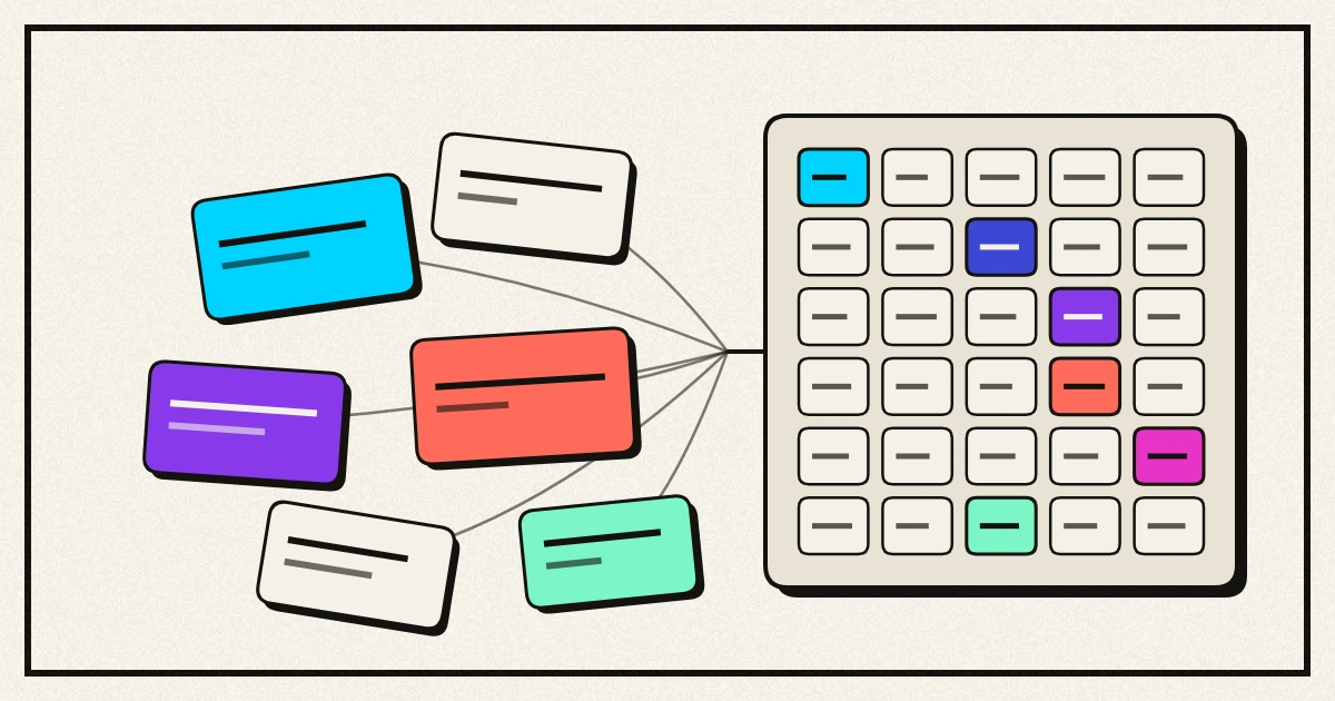
So there are three shapes underneath everything. A number over time, a list you tick off,
and a clock that runs. Nine of the thirty modules run on those three shapes today, which
means the next number I decide to track is an entry in a catalogue rather than a screen
somebody has to design. The other twenty-one earned their own: a week grid, a photo
comparison, a dose schedule, and the trip planner I’d been faking in Notion.
That’s the whole trick, and it isn’t a programming trick. It’s what you notice when you
finally write your entire life down in one list.
The small stuff is the app
Nobody keeps using a tracker because of how it’s built. They keep using it because logging
something takes two seconds and doesn’t make them feel stupid. A good share of what I asked
for is this sort of thing, and none of it needed me to read a line of Swift.
Dates get shortcuts. Almost every date I enter is within a week of now, and the normal
date picker turns that into a nudging exercise. Today, tomorrow and next week sit right
beside the control, and changing the day keeps the time I already set.
Typing keeps working after Enter. Adding five things to a list should not mean five
trips back to the mouse.
Quick add shows its working. Type “submit the report friday at 3pm p1” and it fills in
four fields for you. Every piece it thinks it recognised is highlighted back at you,
because parsing what you typed is a guess, and a guess that quietly eats a word out of your
title is worse than no guessing at all. It’s also deliberately timid: “buy 2 apples” keeps
its 2, and “monitor” is not Monday.
Deleting tells you what it costs. Delete a habit and everything logged against it goes
too, which is correct and was also silent. Now it says the actual number out loud: “this
also deletes 43 logged days, this cannot be undone.” The part I like is that a delete with
nothing to lose asks nothing at all, so the warning never becomes a thing you click
through on reflex.
Empty screens carry the button that fills them. A first run that only tells you what’s
missing sends you hunting through menus.
Not lying to yourself
This is the part I actually care about, and it’s mostly restraint.
Streaks only count days the habit was scheduled. Skipping Saturday on a weekdays-only
habit doesn’t break the run, and neither does an unfinished today. A streak that punishes
you for your own rules is just a guilt counter, and I have uninstalled several of those.
Budgets judge pace, not totals. A progress bar hides the thing that matters, which is
being 80% through the month’s money on the 10th. So the bar marks where you should be by
now, and a category running ahead of the calendar says so. It stays quiet in the first days
of a month, when it would only be noise.
Mood insights refuse to overclaim. Tagging how you felt with what you did that day is
what turns a chart into something useful, but the wording has to stay honest. Cadence will
tell you that days tagged “exercise” averaged higher. It will never tell you the exercise
caused it. It says nothing at all until there are at least three tagged days and some
untagged days to compare them against, and a difference too small to mean anything gets
called negligible instead of dressed up as a finding.
Workouts remember last time. Getting slightly stronger is the entire point and nobody
remembers what they lifted on Tuesday.
Switching to pounds never rewrites your history. Units are a display preference. What
gets stored underneath never changes, so the past always says what it said.
Where the engineering went
Some of it is invisible and that’s the point.
Everything lives on your own machine. No account, no server, nobody’s cloud, which is less
a privacy stance than the simplest thing that could work for an app whose only user is me.
There are 636 automated tests, and they’re aimed almost entirely at the parts where a quiet
mistake would corrupt something I care about rather than just look wrong: the habit history,
the maths behind the charts, unit conversion, and every delete rule in the app.
My favourite bit of engineering is one I’d never have thought to ask for. There’s no
screen-recording permission on this machine, so nothing could take a picture of the running
app to check a screen actually looked right. The workaround was to build each screen
invisibly, off to one side, and photograph that instead. It immediately caught three layout
faults that reading the code had missed.
And a constraint I enjoyed: iPhones only allow an app 64 pending notifications, ever. Ten
medications taken three times a day would need 210 of them. Collapsing “every day” into one
repeating reminder instead of seven weekly ones brings that to 30. When it does run out,
Settings says so rather than silently dropping the ones that didn’t fit.
The icon went through the most drafts. The first attempt was three concentric rings, which
is the Activity app’s mark and every habit tracker’s after it. What it is now is a
checkmark whose long arm bends as it climbs. Two straight arms is the mark on half the todo
apps in existence. The bend is the only part that’s ours.
What isn’t built
This is version 0.0.1 and I’m the only person using it.
- iCloud sync is written but unproven. Everything is in place for it, but actually
turning it on needs an Apple developer account I haven’t paid for yet. Flipping the
switch today quietly keeps you on the local copy rather than breaking.
- Apple Health sync is in the same state, for the same reason.
- There are still two todo systems. The planner’s tasks and the todo lists module can’t
see each other, which is exactly the sort of split this whole app exists to stop. Merging
them is a decision I haven’t made yet rather than a job I haven’t done.
- There’s no undo and no trash. There’s an export instead, which is why deleting warns
you properly and why “this cannot be undone” is literally true.
- Nothing reads the export back in. It’s a safety net you’d have to rebuild from by
hand, which is a poor sort of safety net.
- No home screen widgets, and no dragging to reorder your day.
Does it actually sort anything out
The bet is that a task attached to a trip, a recipe, a goal or a habit can do something a
task in a normal todo app never can. Right now that’s half true. Notes link out to nine
kinds of thing, and nothing yet links to a task, so the most interesting version of this
idea is still ahead of me.
What I can honestly claim is smaller. Everything I track is in one place, on my own disk,
in a shape I chose, and I can read every word of it back out whenever I like.
That’s been enough to keep me opening it, which is the one test every habit app I
downloaded eventually failed.